Responsive Web Design
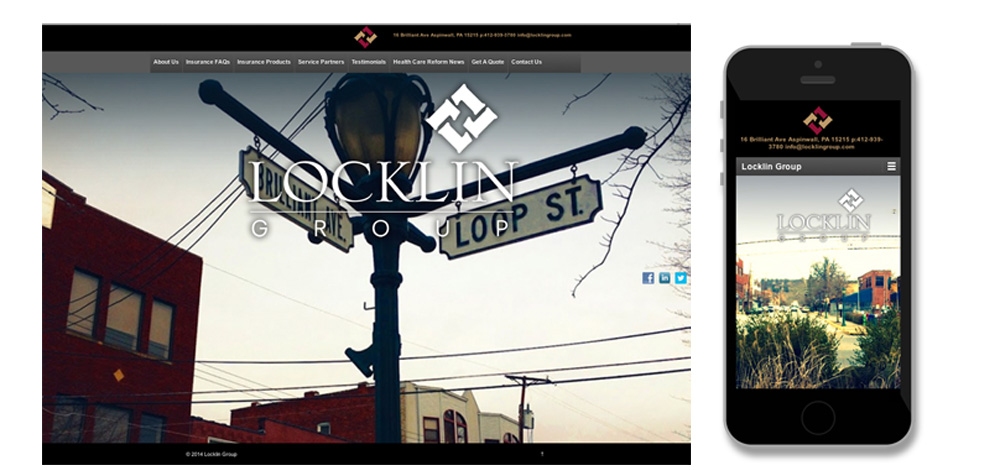
We design and program all of our sites with the concept of Responsive Web Design. Responsive Web Design (RWD) is a design methodology that allows a site to provide an optimal viewing experience—easy reading and navigation with a minimum of resizing, panning and scrolling—across a wide range of devices, from desktop computers to laptops to tablets to smartphones. A site designed with RWD adapts the layout to the viewing environment by using fluid, proportion-based grids, flexible images and navigation, and CSS3 media queries.
Responsive web design serves the same HTML code on the same URL regardless of the users’ device (desktop, tablet, mobile, non-visual browser), but can render the display differently (i.e., “respond”) based on the screen size. Responsive design is Google’s recommended design pattern.
If you want to know if your site is eligible for the mobile-friendly label in Google Search click here to get FREE mobile and speed test performed on your website. The results will be emailed to you with recommended actions.